
THE BACKGROUND
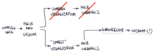
During my research term, one of the things that caught my attention as a designer was how, in contemporary data visualization, the larger the number of quantities represented and the wider the links between them, the more the visualization can be considered as “interesting”. Faced by the complexity of the data, designers tend to translate links and quantities into highly aesthetic products, concentrating the force of the graphics into representing the complexity itself as the only (or the most important) thing to communicate. This represents a paradox:
complexity + design = equal (or greater) complexity.
It seems it is much more easy (and efficient) to translate into graphic terms the difficulty of understanding rather than try to transform that difficulty into simplicity. One reason could be that data visualization has its roots in scientific areas, so is hard to export it outside these boundaries and talk to a broader audience. So designers prefer to cosmeticize the statistics to avoid damaging the data. Preferring showing to explaining raises two problems:
– the number gets untied from its context
– the graphics becomes mere decoration.
The AEDO application aims to resolve these two issues.
NOT-SO-EASY-TO-DEFINE USERS
Consumers of modern visualizations are difficult to trace. If we put aside scientific and technical users, those remaining are very heterogeneous. However, from graphics illustrating the US elections to representations of the Chinese economical miracle, something links them together: between the pages of a newspaper or in front of the computer screen, people seek graphics which help them understand what’s happening around them.
Visualizations achieve this very effectively, but can we increase their power to facilitate the generation of knowledge? In my opinion, yes.
TALES TO EXPLAIN, AND TO SEE
AEDO relies on the simple idea that showing data is not enough to understand it: is better to recount it. Adding a narrative level to the representation layer, the application incorporates a new meaning to the graphics, giving them a real life sense. A story has the power to explain how the numbers affect us because it:
– is closer to the real life than the abstract graphics
– builds empathies between readers and characters
– gives a context (even if is imaginary)
– adds an emotive tone
– can be very specific, but gives space to the imagination.
HOW IT WORKS
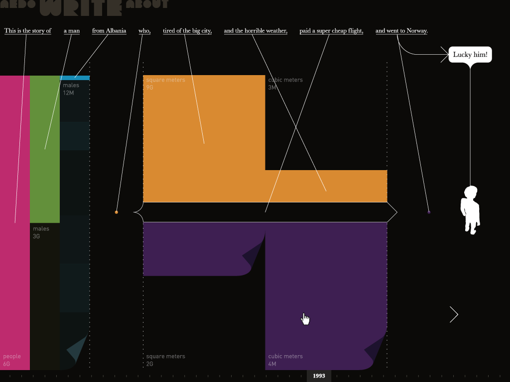
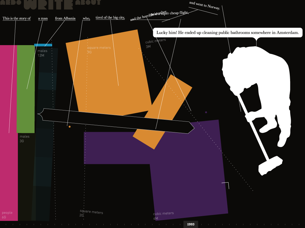
If we want to invent stories, we first need a subject. For this application, I decided to take advantage of my previous knowledge about global migrations and use it as a sandbox to develop the prototype.
AEDO uses several datasets from the United Nations UNdata portal to build its tales and graphics. It randomly selects one database, reads it, and generates a phrase or word that represents it. A graphical visualization of the data is produced at the same time, and the final sum of graphics and words creates a tale about migration.
Interaction is possible via a series of metaphors that allows deeper exploration of the data and its possible links. Parts of the tale (like countries, genres and years) can be changed, which updates the graphics and texts in real time.
Video of the running application / 1024×768 / 800×600
THE FUTURE
Storytelling is an effective way of adding more power to data visualizations because it allows scenarios to be built more accurately, and provides an emotional level that permits the imagination to play with numbers. Can you imagine feeding this application with the receipt of your last trip to the supermarket, or seeing/reading a tale about your blogging habits?
As numbers, tales are everywhere.
Download a copy of the final report (in Italian), or look at it online*:
Single pages – 5MB
Spreads – 3MB
*Please, give it some time to download, and click on the pages to go full screen.
I would like to thank Wolfgang Scheppe for giving me the starting point for this project, Iman Moradi, Nathan Yau, Monica Sanchez and all the wonderful people at Medialab-Prado in Madrid for their initial thoughts about visualizations and their possible implications, and the IxD friends at IUAV who supported this work with their valuable comments.