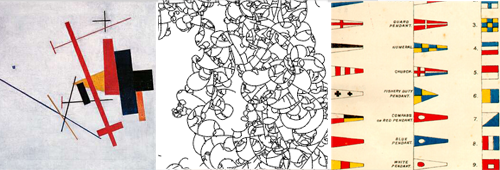
The first intention was to formulate a whole new code of visual communication related to personal moods. We wanted it to appear like suprematist paintings or organic compositions. But it had to behave both automatically and user determinately, incomprehensible and representative. The whole visual language had to be coherently connected to the expression of the feelings without seeming too simple or romantic.
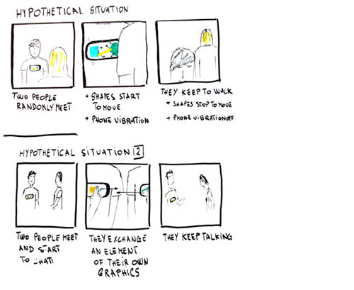
We found it impossible to formulate valid categories for human feelings without constricting people to choose from a list of adjectives: we tried to divide character and mood, to use Hippocrates’ theory about humors and little part of phrases to compose according to user’s mood.
Robo – First Prototype from interaction-venice on Vimeo.
Moreover we could not connect shapes, colors, movements to something not homogeneous with them like human mood. It could be interesting to connect the dynamics of feelings with the organic behavior of a generative graphics. But the result seemed too tiny and delicate to catch people’s attention in a small screen on a t-shirt. Then we tried with naval flags: a too simple language for our aims. The idea of moods was not convincing too.
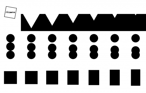
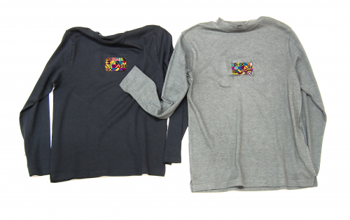
We found heraldry was a good way to express a social position and its possibility to be modified by social interaction without being too romantic and avoiding strange forced matches between identity and visual images. We tried to design a new graphic by squares from simple heraldry elements. It could work very well by user choice and not by automatic attribution and we could formulate a big range of graphic opportunities starting from very simple elements. For the study of color combinations we considered Alighiero Boetti’s tapestries, a good graphic model and conceptually interesting for our aim.
Robo – Beta animation 2 from interaction-venice on Vimeo.
Robo – Beta animation 1 from interaction-venice on Vimeo.
.
home | conept | design | process | code | critical reflection | | credits | downloads |