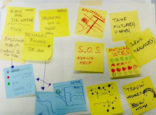
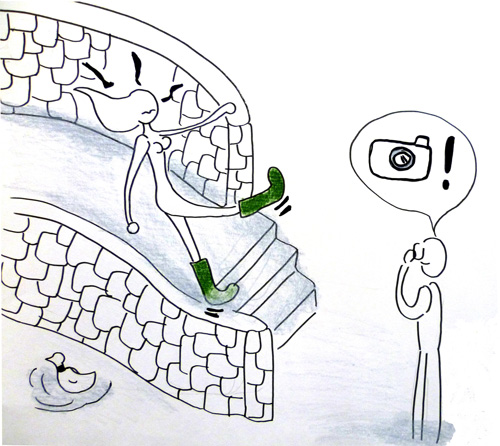
Early sketches and studies of concept
Project focusing
Right from the start we were thinking about the magic relationship between Venice and the water. We wanted to create a flux of memories and emotions shared by people, and relate them to the metaphor of the Sposalizio del Mare (the marriage of Venice and the Sea – an historic festival)
We imagined thousands of messages carried by the waves as a gift to the sea.
Then we focused in on the phenomenon of aqua alta, which gave us the possibility to narrow down the message content range and design an application closely related to Venice emphasizing this special peculiarity.
Our aim was to use the full interface potential of the iPhone (such as accelerometer, compass, GpS, etc.)
Early drawings about acqua alta concept
Design development
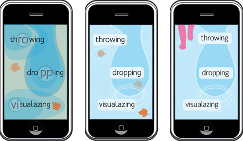
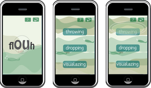
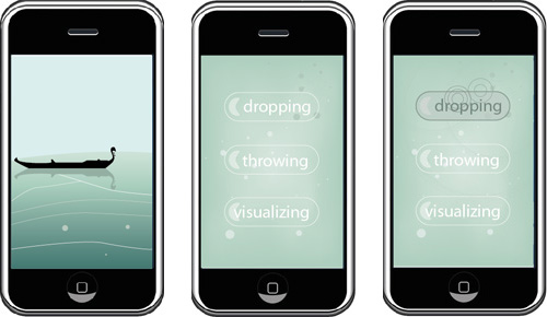
In this phase we decided the main functions of our service: “dropping” a message in a certain place or “throwing” it to everybody who is connected to the app. During this step we faced some obstacles in finding out the right navigation flow: the application needed to have a quick, simple and enjoyable interaction in order to allow the user to share his messages fast (because during acqua alta days it always happens to be in strange and weird situations!). But at the beginning we put the user in front of a choise of three possible actions, using just buttons for navigation: rather boring, as Philip, Gillian and our classmates suggested us. Instead, the user should be prompt to explore and go on through the screens of the application. These problems affected also the graphics and the first proposals were too flat.
First graphic proposals
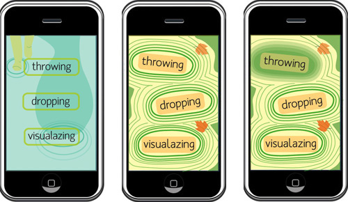
In the following steps we changed the principal navigation flow, but our main challenge was still to develop the right graphics and interaction style avoiding the rigid use of text and buttons. We used some bubbles to represent icons and tidings on the map.
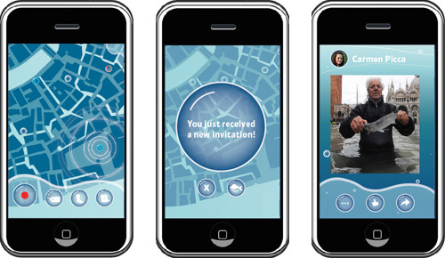
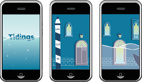
After many graphic suggestions, we decided on the final one and found a series of metaphors to recreate a typical venetian atmosphere and we added a fun animated wave that informs about the level of the tide. Instead of bubbles, we have been keeping the concept of a message carried by the sea using the “message in a bottle” metaphor.
Final screens of the application
