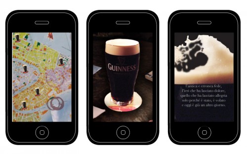
Fascinated by the theatrical urban life of Venice of the past, we started thinking about how this unique quality could help us designing something new. We focused on the historical rituals, entertainments, assemblies and society’s hierarchies of Venice and we saw that reading was a constant part of all these events: there was a reading (and a reader) to announce
a death sentence, a new tax, a war victory, etc. We also thought that public reading could be a good way to emphasize the theatrical side of an interaction: we used it as the focal point of our design process.
During the initial phases of our design path, we found inspiration looking at the Book Crossing system, the London’s speakers’ corner and, particularly, thanks to the Dead
Poets Society, a movie directed by Peter Weir (1989).
At the beginning our idea was to propose an application that would suggest a public reading
in a particular place in Venice. It had to be an application only for a restrict number of users:
a sect of literature lovers. But evaluating all the possible locations and interactions, it was hard for us to be convinced by this idea; standing, listening to someone reading without
a strong motivation and without something that really engage the user, wasn’t a great
solution for our project.
We figured out how the reading purpose could be combined with a location, motivation and interaction that would impress the user and wouldn’t let him go away. We converted the initial outdoor application into an indoor one: we chose a pub. A pub as a place where people like to be, where they spend their time doing nothing but feeling good, drinking a beer and chatting among friends.
Focusing on the pub environment and the typical gestures related to it , on beer companies (we chose Guinness), on public reading and international literary awards, we thought that combining these different aspects we could have the chance for working on something convincing, interesting, new. This brought us to our final Pint of Words application.
Graphics
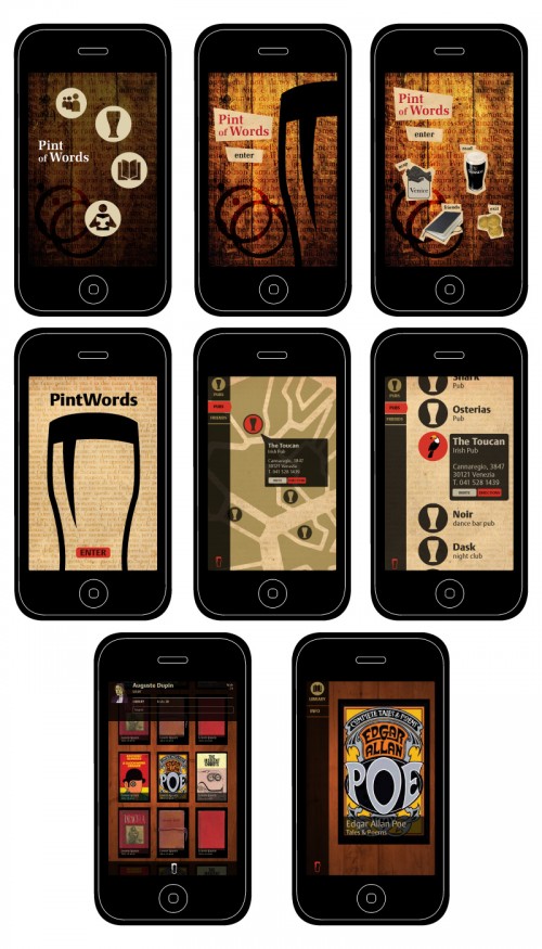
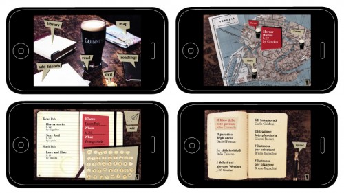
For the graphic design aspect of our application we decided to try with two hypothetical solutions, a photorealistic one and a more schematic and abstract one.
The aim of the photographic proposal was to get the user completely into the application, drawing him inside, letting him sit at the best table, with the best pint of Guinness on it.
The purely graphic proposal instead, pointed out on basic stylistic elements, with a simple and clean nature, to assure an efficient structural organization, a good navigation and an ease of use. It was strongly reminiscent of the qualities of books, their typography, binding.
After evaluating the two proposals we decided to develop the photorealistic one because
of its more expressive and snappy identity, and because it had a better answer to what
we expected would engage the user that, even if the navigation would be less functional attracted by the charming style.
We also maintained some purely graphical elements from the first proposal, in order
to guarantee a level of comprehension and access to the various areas of navigation
of Pint of Words.
Scratched table, dusty books, worn out notebooks, a pub’s own elements, give
Pint of Words a mysterious and intriguing charm.
| home | concept | design | prototype | process | advertising | user tests | code | credits | teamwork | critical reflection | downloads |


