To make the interaction easy and understandable FLYER CAFE needed strong and clear graphics.
To do this, we chose a color based distinction of the coasters, combined with a choice of icons based on what we usually use to manage paper sheets.
Coasters.
As the typology selector.
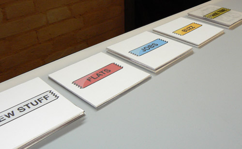
The tipology of the announce are wrote on the coasters in a way that simulate a note on a piece of colored sticky tape. When the coasters are recognized by the system the are hilighted and give also an indication about what category of flyer you are watching.
Sugar bags.
As the paper clips.
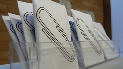
For the sugar bags, that allow the user to keep apart some flyers in which he is intrested, the chose icon is the paper clip. On the back, as for all the other things, there is printed a fiducial.
Spoons.
As the magic wand.
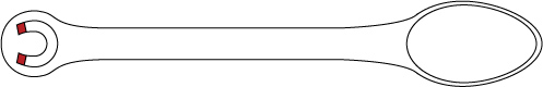
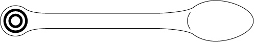
On the back of the spoon is printed a magnet that correspond , on the other side, to the finger fiducials for reacTIVIsion.
The spoon attracts the flyers like a magnet and when a person take it off from the surface, the flyers gradually decreese their speed.
Flyers.
Another important step was realize a graphic style to the announce in way to have a good appearence.
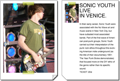
These are front and back of the announce. All of them are dysplayed on the front side when are clustering aroud the coaster.
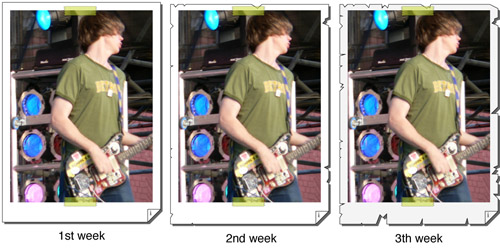
Last part of the graphic style is the flyer decay. Like happens at the real flyer on the wall in the street, also the announce on FLYER CAFE start ruining in the time to desappear completely at the end of the month.
FLYER CAFE | more details | stuff graphics | building prototype | programming | who did what | technology